PMS's backbone are their color swatch books, a series of books which show the exact shade of each of thousands of colors and tints so designers can find just the right shade for their project.
But Zazzle doesn't use Pantone. Zazzle uses an rgb (red/green/blue) color space which is actually rather odd, since rgb is meant for monitors. And since monitors are lit from behind, colors appear very different than they do on a flat piece of non-luminous printed material, whether it be a t-shirt or an invitation. But say you want to get something at least fairly close to a PMS match and you want to know that a certain color is being printed on your design. How do you do it?
First you invest in PMS swatchbooks. My suggestion is to go for the basic gold-standard, the PMS Formula Guides for Coated, Uncoated, and Matte. These are their basic color sets, printed on shiny (coated) dull (uncoated) and matte finished papers. A color will look very different depending on what surface it's printed on, because the harder the surface, the more the color will sit on top. The softer the surface, the more the color will soak in. A color that looks very bright and saturated on a coated surface will look much darker and duller on an uncoated one. Yes, this is an investment. But well cared for, your swatchbooks will give you years of service.
Okay, so now you have your books. You want to do a wedding invitation, and you know you want to select a gloss finish in Zazzle for the invitation. So you flip through your swatchbook for the color you want to lay over the background, and you choose PMS 7503. But there's nowhere in Zazzle to specify Pantone colors. Because Zazzle uses rgb web colors. Bummer. However, at the bottom of Zazzle's color palate is a place where you can insert a HexDex color value. This is a combination of six letters and numbers that simulate other colors. The trick is to figure out which HexDex value most resembles PMS 7503. And actually, that's easy to do if you have Photoshop or Illustrator.
In Photoshop, you only need to double click on the color swatch in your main toolbox to bring up the color picker. Once there,click on Color Libraries, and chose Pantone Solid Coated for your book. Scroll down and pick Pantone 7503 C, then click on "Picker."
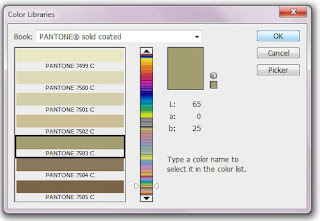
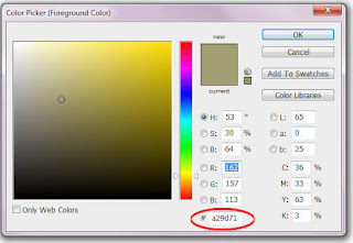
Once you're back at the picker screen, all you need to do is find the HexDex value at the bottom of the screen. Write it down. You can then assign that number in Zazzle to replicate very closely the PMS color.
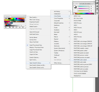
It's a bit more difficult to find the value in Illustrator. First, you have to locate the color books. Click on the Swatches, then on the little arrow and menu icon at the top right to open the full swatches menu. Click on "Open Swatch Library," then "Color Books," then select "Pantone Solid Coated."
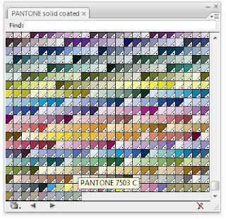
This will bring up a window full of tiny swatch colors. Click on "show find field" to be able to enter a number in that menu (which I find only works about half the time). Or just scroll down until you find the color; hover over a swatch with your mouse to bring up the number.
Once that's done, you can double click on the color on your leftside toolbar to find the HexDex value as you did in Photoshop. As a designer's note, I make the Pantone color book as part of my Workspace in Illustrator by dragging it over onto my rightside toolbar and saving the workspace.
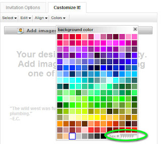
In Zazzle's Background Color box, the value you need to replace is at the very bottom right, with a greyed out "FFFFFF". Just replace the FFFFFF with the appropriate HexDex color, in this case (a29d71 in this case). I follow internet conventions to enter all code in lower case.
I find that greens and blues tend to color shift fairly dramatically from PMS book to screen, but usually the PMS value will work for your Zazzle pieces quite well. Be sure to keep your PMS books in a cool dry place, and always closed, to prevent sun-fading.


