Zazzle does provide a number of different fonts, and I do use them on occasion but perhaps not as often as others do. I pretty much only use Zazzle's fonts for designs where customers will be inputting their own text. I'll use Zazzle fonts on the inside of cards as an example. But other than that, I prefer to use my own fonts, even if my font is identical to one of Zazzle's. Why? Because when I'm using my own font in my own design software, I have much more power to get that font the way I want.
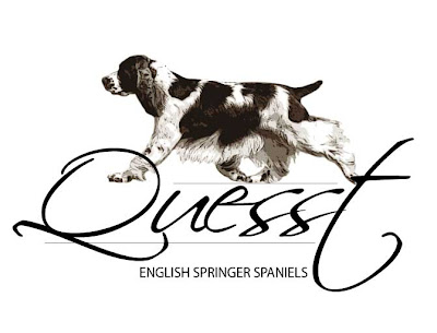
Let's take a logo I just designed for a friend. I used two different typefaces, Scriptina and Myriad Pro. If I had those fonts in Zazzle, I'd be forced to use them as is, at the weight and spacing they come in. That logo would look like this.
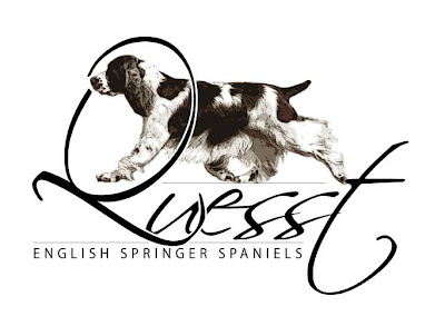
 Now let's look at that logo again, this time with changes. I made the Q bigger, distorted it some, and overlaied it so it fit better with the rest of the word. I added a lot of character spacing to the words "English Springer Spaniel, to give it dramatic emphasis. The difference is what makes this a logo, rather than just a collection of items on the page.
 You too can make fonts work for you. The first thing to decide, when you're doing a piece for sale at Zazzle that will involve fonts, is the message you are trying to convey. Do you want to be bold? Angry? Sweet? Soft? Lovely? Elegant? Persuasive? Traditional? Modern? Funky? If you have artwork, your font also needs to match your artwork. Putting a super-elegant script font with a modern, funky piece of artwork is likely to be jarring to the viewer. It won't match.
Don't get carried away either. With very few exceptions, you should not use more than one or two typefaces per item. Too many typefaces quickly starts to look junky and unplanned, and I bet most of you don't want that to happen. One trick some of us use is to work with typefaces that have a good number of weights and styles. Myriad Pro is one of my real "go-to" fonts, because it's readable at very small sizes, it can carry body text or titles, and it has light, regular, semi-bold, bold, and black faces in book, italic, and condensed. If I had to live my life with only one or two fonts (oh, the torture...), Myriad Pro would be one.
Serif vs Sans Serif
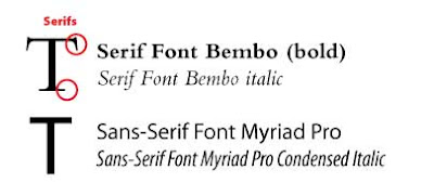
Some of you probably don't even really know what Serif and Sans-Serif means, so let me give you a quick definition. Serif fonts have serifs. What are serifs? Serifs are the little "feet" on letters. So serif fonts have feet. Those little feet help lead the eye from letter to letter and generally make text more readable. That's why you'll find the text in every novel you buy in some sort of serif font. The most used (and overused, and tired, and please do not ever use it) serif font is Times Roman.
Sans Serif fonts are fonts without feet. Sans means without in French, so it's pretty logical. Sans Serif fonts make great header fonts, but also are good to use at very small sizes because they tend to maintain their weight through the stroke, unlike serif fonts that often get thinner and fatter, thus fade out at tiny sizes. Arial is today's most common Sans Serif font and again, should be avoided in artistic design for that very reason; it's tired.

In addition there are, of course, many other font types. Decorative fonts, script fonts, display fonts, hybrid fonts (which combine elements of both serif and sans serif, a good one is Trebuchet, which this blog is using).
I could write books about fonts, but I won't. It's already been done. The purpose of this post is to try to get you to think about fonts as design elements and use them appropriately. If possible, it's far better to create your design's fonts in programs such as Illustrator or Photoshop where you have unlimited ability to manipulate them rather than just relying on Zazzle's fonts. Meanwhile, start thinking about the best way to incorporate text into your design, and your design into text. The right choice, manipulated the right way, is the difference between okay designs and dynamic designs that sell.


No comments:
Post a Comment